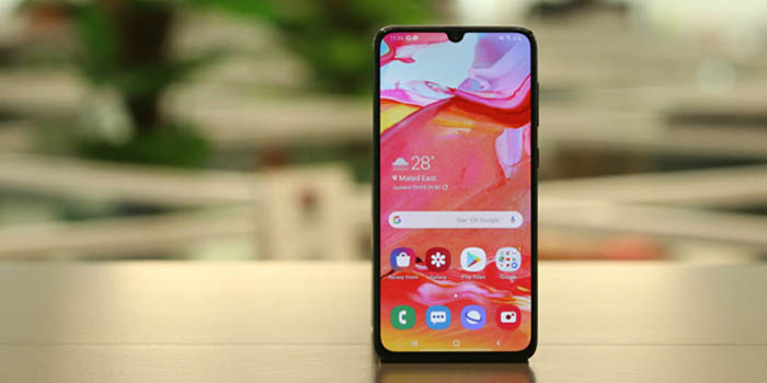
Recently, Google has rolled out a ‘major’ UI change for the Google PlayStore – they have just replaced and reshaped the icon, but still, it appears a ‘major’ change!
With PlayStore getting a new visual makeover, mobile UI experts are forced to reconsider whether the early-2019 design trends are still applicable in mid-2019? Hell no! (Nothing stays the same for 6 months in an industry where a change is a matter of a few days only!)
Thus, sensing the urgency, I have shared a table with my company’s leading UI engineers and listed out the best Mid-2019 mobile UI trends and apps having the best UI in 2019.
So, without any due, let’s proceed.
Top 5 Mid-2019 Mobile App UI trends
Before I reveal the list, let me first summarize the two major advantages of revolutionary designs: better user experience and better sales.
More intense animated visuals (on every screen, on every click)
Previously, poor bandwidth and law hardware specifications were restricting UI designers to add intense animation in the app. And they were right. Animation adds extra seconds to open up the app and run the app. The situation used to get worse when the user didn’t have enough bandwidth and have a mobile phone with low hardware specifications.
But the advent of 5G technology and more powerful phones have changed the game of UI design. Now, UI designers prefer to fit animation in almost every screen, on every click. With the animation, they keep the audience engaged which eventually makes the app successful.
3D flip menu
3D rendering and CG augmentation of real footage have been in existence for quite a good time. But same as animation, UI designers have been avoiding it for the sake of speed and performance.
Since now this luxury turns into an affordable feature, UI designers start taking 3D animation into account. Their most prefer space to use 3D animation is flip screens. It makes a transaction between two screens smooth and appealing.
Dark background with vibrant color and meaningful gradients
In early 2019, the UI trend was toward white background as it looks calm and doesn’t annoy users. But soon, with the launch of ‘dark mode’ from mobile OS to twitter app, the trend shifted to a dark background with vibrant color and meaningful gradients.
However, there is one challenge associated with the dark theme – it only works well if you precisely choose the vibrant color and meaningful gradients. To understand it in a rational way, please refer to the following image. Here, as you can see, the app background is dark, but in the large portions, the color is not too bright compared to small portions.
Line size icons and icons with gradients
Most of UI designers, except pro ones, don’t consider icons as a part of UI design. But it is. A well-designed and well-presented icon makes users eager and attract them to click on it.
Recently, the trend of line style icons with gradient color has popped out. These linear style icons are easy to craft and it works practically anywhere on any background type.
From the following image, you can clearly see that all icons are having Line Style Design with gradient colors and they look elegant.
Gesture Driven UI
Gesture driven UI is not at all a new concept; it has been there ever since the first touch phone has been launched. But in mid-2019, designers are making users use gestures for the sake of completing desired tasks in very little time. For that, they have found more usabilities of some popular gestures like tap, swipe, and pinch. For instance, the YouTube app allows users to remove the video by just selecting the video and swiping it left. This kind of gesture UI allows users to complete the action faster than conventional UI. Gesture driven UI is so good that Apple and Google have introduced the same design features in their OS.
However, to teach users using gestures is a tedious task. You can add a tutorial in your app, but it can be lengthy and it can annoy the users. Instead, add a small interactive tutorial on every screen where you have introduced gesture-based UI. For example, YouTube doesn’t teach about its gesture of removing the video as soon as you open the app, but it teaches you when you minimize the video. (as shown in image)
To understand these trends and mobile app UI principals more rationally, let me reveal one more interesting list: top mobile apps with the best UI.
Top mobile apps with best UI, satisfying mid-2019 UI standards
Human – Activity Tracker
![]()
Human – Activity Tracker app has taken the use of dark background to the next level. It shows all nearby people using the Human app for tracking their activities in different gradient colored dots in a black map which looks electrifying. In fact, it’s all app windows are having a black theme with precisely used color.
Warby Parker – eCommerce
Warby Parker is a New-York-based online glass selling company. The UI of its app is so minimalist and justifying all app features in the best possible way. They have preferred a white background with large fonts and very less content on an app window. Their app also enables users to virtually try different glasses.
Dribble – social app design app
Dribble is the social app design app where designers from all over the world share their design projects. The reason why Dribble seized the position here is because of its unique color combination – black & white. And where this color combination doesn’t work, they used their logo color which is pink.
Kitchen Story – cooking app
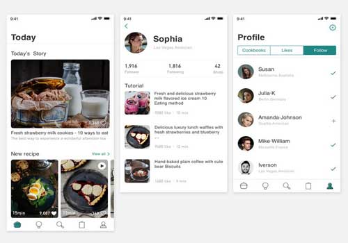
The Kitchen Story app has set an example of the proper use of fonts. Since it is a cooking app, there is a lot of content. So, to make the reading of that content enjoyable for users, they have opted for a white theme, instead of black.
Bird – e scooter sharing app
Bird which is a unicorn e-scooter sharing company has updated the UI of the app many times. In its UI of the previous app, as shown in the following image, there are a lot of loopholes, affecting the user experience.
But after it went through a series of visual makeovers, the final product is outstanding. They have solved every problem related UI by considering user behavior. Their app that falls under the transportation category now helps users to navigate the app and navigate the real world at the same time.
In the nutshell
Having an interactive UI is the well-explored and proven strategy to attract the users, to keep the user engagement rate high and to earn more money. However, trends are also important. They show us the current market scenarios. By following the trends, we never goof up the app UI designing. The trends we have discussed in this blog are likely to continue dominating the industry for at least the next 8 to 12 months.
About the Author : Vishal Virani is a Founder and CEO of Coruscate Solutions, a leading e-scooter app development company. He enjoys writing about the vital role of mobile apps for different industries, custom web development, and the latest technology trends.